- Architects: Archielecto
- Design Team: Dilip V Gujar, Hitesh D Gujar & Shruti Kamath Gujar
- Location: Nashik, India
- Project Year: 2022
- Photographer: Yash Kataria
- Author: Pavitra Karwa
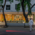
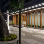
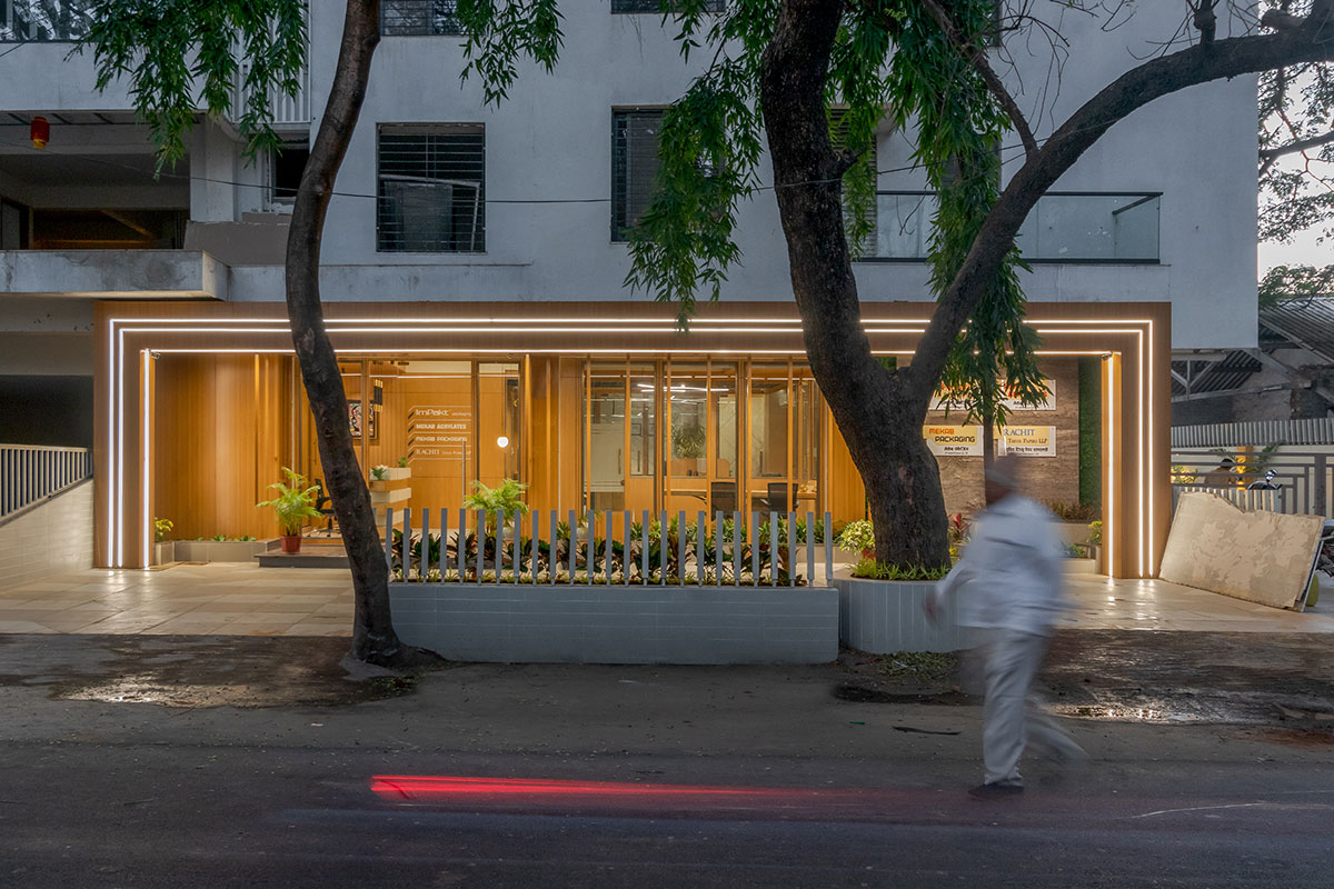
What can describe an entrepreneur more precisely than his own workplace? A 1500 sq. ft area converted as an office space is a blend of multipurpose use of space with aesthetics. The site is surrounded by typical commercial and residential units. This whole setup contradicts the needs of the client therefore the creators intended at designing a space that makes one look inward to have a calm and composed setup. The built fabric consists of an entrance lobby, waiting area, multipurpose space, workstations, cabins, a pantry, and a toilet.
Concept
The main aim of the design was to celebrate the existing spatial condition to the fullest. The office was also imagined as a space that can host different events for the staff, friends, and family. Thus, the central point of the idea was how all the places flow into each other yet function distinctly. This led to an open and flexible floor plan, which allows each area to swell and contract to acclimatize to various events.

Process
Decoding a design concept into an operational one requires an unambiguous understanding that the efficacy of the project depends on the way the space meets the demands of the owners. Therefore, the whole design evolved by acknowledging end-users in terms of their leisure and day-to-day activities. This design method led to the completion of the project within 7 months and added value to the lives of the owners.

Design
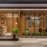
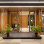
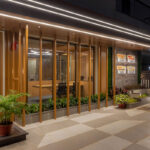
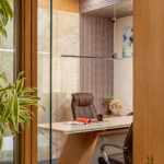
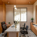
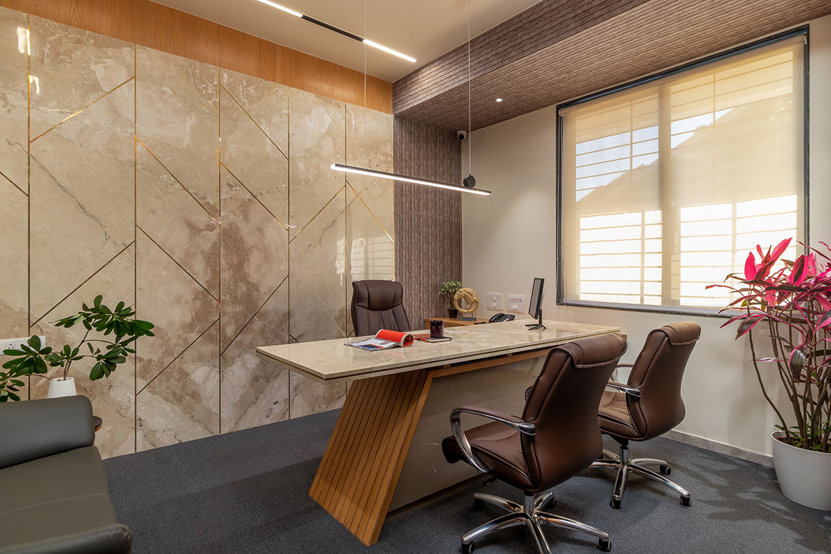
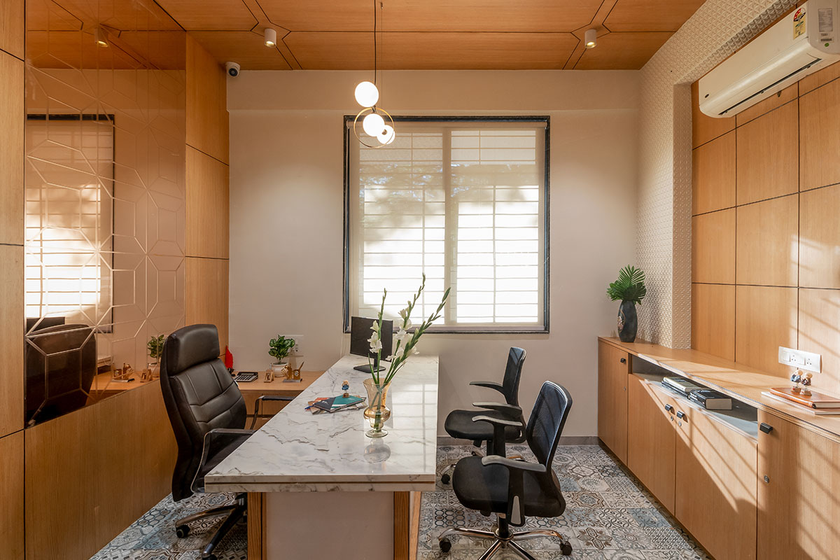
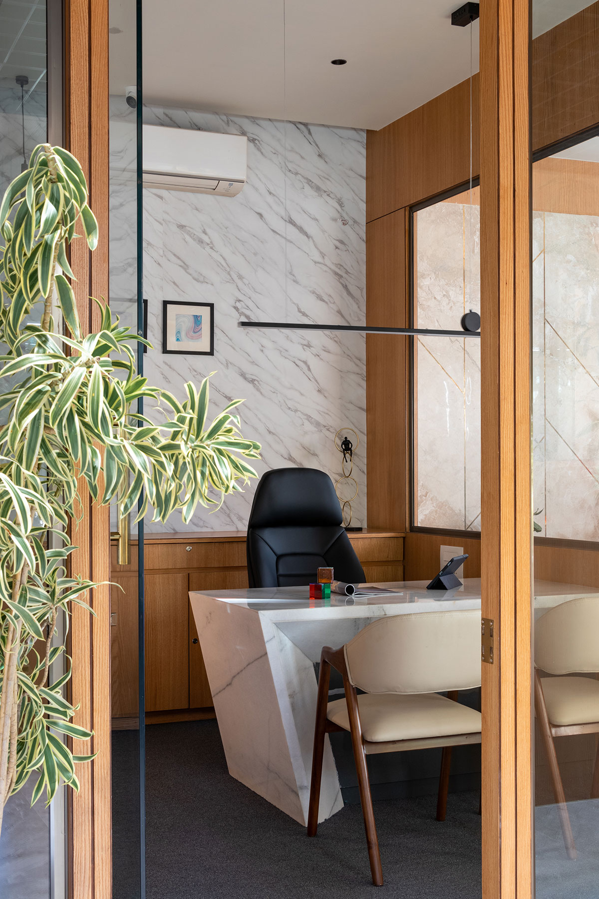
By visibly incorporating nature into the architectural experience of the space, the design aims to create a place to work that responds to the immediate setting and the climate of the city. The derivation is a well-organized area with a modern appearance and traditional values. The interiors are kept simple by giving more importance to the architectural experience. Materials such as wood, marble, shades of grey and indoors populated with easy maintenance plants give a natural feel to the space.
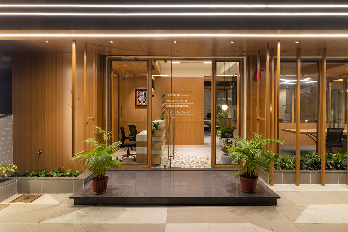
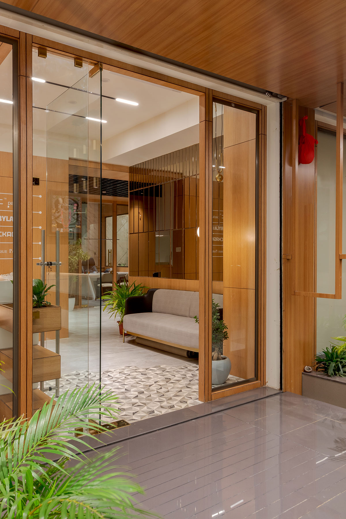
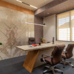
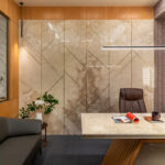
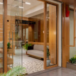
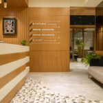
Tactfully designed furniture pieces were introduced to add warmth to the spaces. Overall, the material palate was kept natural, without any superficial layering, to boost realism and comfort. On arrival, we see a lobby characterized by a tinted mirror wall designed to add grandeur and a wooden partition that divides the space perfectly into the common waiting and workstations. The small waiting space is carefully crafted with flatbed cushioned seating to accommodate a crowd.

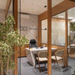
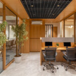
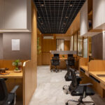
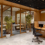
The seating faces the reception area which further connects to the pooja room and the cash counter cabin. The area assigned for the workstations follows the same minimal and formal language. It is a minimal composition of wooden tables, chairs, and plants. This semi-private zone further connects to the cabins, where every cabin follows the same theme but standout differently. Despite the office being adorned principally in a single hue, this design by Archielecto is bold, arresting, and unrepentantly alluring.
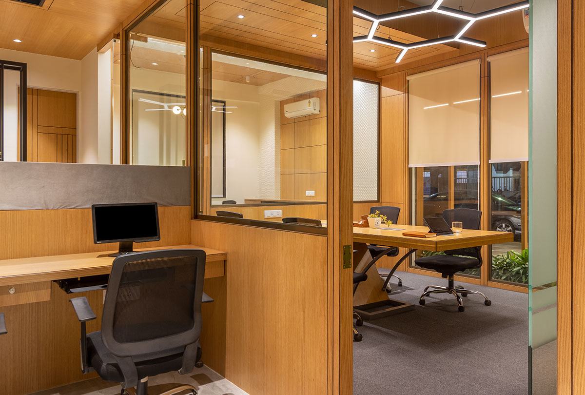

This work environment seeks to demonstrate innate truth by keeping the interior simple and highlighting the built experience achieved by blending functionality with the environment.
Text description provided by the architects

